Tuesday 26 April 2011

Post office sign and awning applied

Post office sign and awning

I quite like it. Not perfect, but eh. :)

Now I need to make a post card rack, village notice board, letter sorting rack, scanning and fixing the two post office books that came with the building and the welcome mat. It would be nice if I could get a set of scales for the back too.

I think I'll make the post card and letter sorting racks out of some balsa wood I have. I don't have any piece of Sylvanian furniture that will do the trick, unfortunately. I hope I can find some cork paper for the notice board, but if I can't I'll just print out a cork board texture. Not really looking forward to redesigning the two books, I'm a little fed up with messing about in Photoshop for now. As for the welcome mat, I'll just cheat and print that one out instead of looking all over for a mini one. We'll see how that works out.

Monday 25 April 2011

Post office sign and awning updates

This post will be more of a work process journal than anything, just in case I need to refer to it again. I am by no means proficient at photoshop so this is just me fumbling around till everything looks ok.

I scanned in the original awning of the post office with the intent of tracing it in order to make a template.

Unfortunately the edges were quite uneven as I found out. It might be because of the wear and tear on it (it's an old second hand one after all) or because it was really that uneven anyway, and the patterns on it just served to hide it. The unevenness was really obvious in my traced template so I gave up tracing a few waves in. I wasn't so hot at tracing either, so I figured that some of the unevenness could be chalked down to me.

Photobucket

I ended up just selecting the white outside area, inverting the selection and then filling the gap with the colour I wanted. Nope, still uneven. And I still had to trace too, if I wanted to put gold edging on the wavy bit.

Photobucket

Yeah, not so great. I ended up just drawing my own edges and learnt how to draw wavy lines with the pen tool. I drew that thing on the upper left of the picture below and just copied and pasted it over and over until I had the edge I wanted. Then I filled in the gaps with colour.

Photobucket

I've decided to use 'Sylvania Post Office' on the sign after asking around in the Sylvanian forums. 'The Post Office' was just too strange, despite being what was written on the original sign. I've also set the gradient to 'reflected' instead of 'radial' so there isn't that single spot of light in the middle of the sign. It had the effect of lightening the red too, which I'm happy with. Both the sign and the awning have been run through the texturiser but it's not really visible in these resized pics.

Photobucket

All I have to do now is print it and see if it looks any good on the building. I'm hoping it does. I don't really want to have to redo anything.

Friday 22 April 2011

Redesigning post office signs, Volcaloid, A Game of Thrones blabbering

In between bouts of brainrotting reading junk on internet forums I've been working on redesigning the Sylvanian post office sign while listening to various Volcaloid songs. I actually quite like some of them. I guess the whole 'robot voice' thing doesn't get to me as much because the songs are in Japanese. The English Volcaloids are quite hard for me to listen to. My current favourite is the retelling of The Little Mermaid story sung by Luka. It's so soft and sweet, and evokes the air of tragedy that the original tale has. I like her voice so much more than Miku's, it's not as 'cutesy' and high pitched. Although I do like 'World is Mine' by Miku. Also, the ASK covers! Love em! His voice is so sexy XD~

Ahem. About that post office sign. This is the original:

Photobucket

I scanned it and traced the outline to use as a template. All I've really been doing after that is looking up various tutorials and downloading brushes. Here are my attempts--the ones I saved anyway.

Photobucket

The first one was what I came up with before thinking to look for tuts. It didn't look very much better than the original. The others are the products of various tutorials and as you can see, some of the tutorials didn't work out so well for me. The fourth one is currently the closest to what I'm after, but there's still more work to be done before I print out a final version. I'm thinking of a golden border or at least something to fill in the empty spaces on the sides but I don't want it to look too ornate and overdone. I used this tutorial here.

I recently watched the first ep of A Game of Thrones.

Photobucket

I've been a fan of the books for a few years (Especially A Storm of Swords!). So far I absolutely love the casting! The actors and actresses have done an awesome job at portraying their respective characters so far. I'm looking forward to the rest of the season! And love the pups. So big, fat and cute. Sean Bean didn't actually match up to my mental image of Ned Stark when I first saw the teaser pics--his face looked too chubby. But he manages to pull off the character really well so no complaints there!

Photobucket

And I totally had an internal *SQUEEE* fangirl moment when I saw the Wall. Castle Black, YAAAAAAAAY!

Photobucket

I had an unfortunate moment where I forgot all about the existence of the Godswood and all I could think off when I saw this shot of Winterfell that the big red thing on the side looked like a giant toadstool.

I really hope GRRM finishes his book and releases it by the promised date. Too many fans already believe that the fifth book is never going to happen.

Thursday 14 April 2011

Post office update pics and paper punches

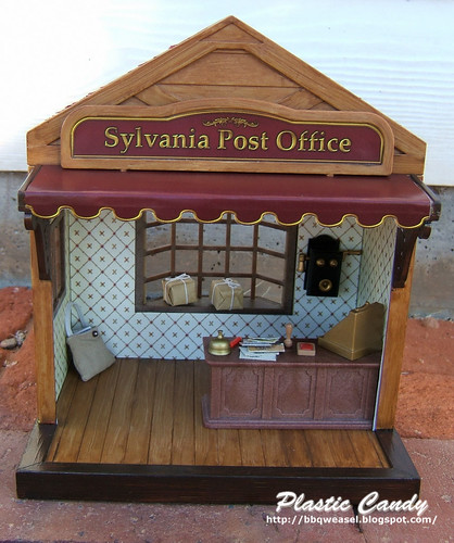
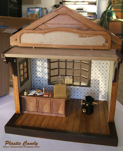
I've recently finished the post office shingles. (Done while marathoning Ghost Whisperer season 3 :p Watching that Bloody Mary episode alone in the middle of the night gave me a case of the heebie jeebies. Gah, mirrors! =_=)
Roof

I used sandpaper spray painted red and then inexpertly 'weathered' with acrylics. I'm not really sure of the look to be honest, but it sure looks a heck of a lot better with the shingles weathered a bit. It now looks less like paper chicken feathers. I don't know, the unpainted shingles reminded me of chicken feathers for some reason.

WIP Sylvanian Post Office

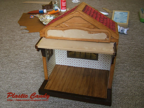
I'm now working on the sign and the awning. I've scanned in the original sign and traced it in photoshop. I'm trying to go for a vintage style sign, something with a bit of a Victorian flavour, maybe? I'm having a hard time coming up with something that looks nice, to be honest. Most of what I'm doing now is researching vintage shop signs and looking for photoshop tutorials that will help me do what I want. What I've done at the moment doesn't look any better than the old sign.

On to other news:

Mini Paper Punch Set

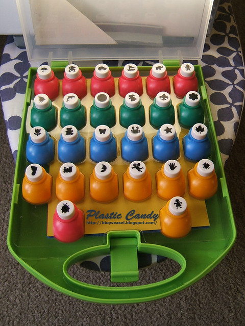
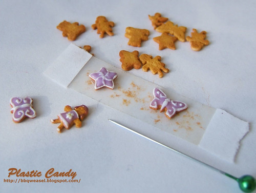
I bought these on ebay a week ago and they've just arrived! I've not felt so excited about a purchase for a while XD. They are just lovely. I thought I was going to get a number of repeats of the ones I already have, but upon closer inspection, the punches are actually quite different, they just have the same theme as the others. The new teddy bear punch in particular has wider paws and is larger.

The ebay listing for this set stated that they were about 10 years old, but they look brand new. Some of the punches are a little stiff, but loosen up after a few presses. I tested the bunny punch on some paper and it wasn't always easy to get it to punch through. It works fine on clay though, which is fine by me as that's all I wanted these punches for anyway. Look forward to seeing more cookies! Though, in a 1:12 scale these will be rather large cookies. They'll probably look good enough with Sylvanians though.

I'm really pleased the set included a mini circle shaped punch. I've been looking for a small circular punch for ages! I'm going to start making cupcake liners again, the last ones I did (for the Totoro cream puffs) I drew circles with a felt tipped pen cap and cut them out manually.

Random Mini Paper Punches

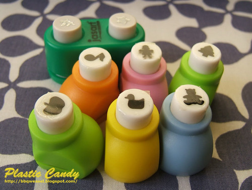
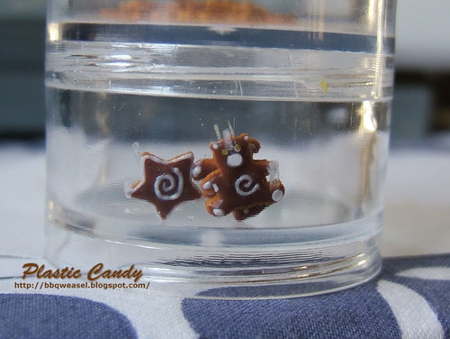
And just so they're not left out, here are the punches I got when I was in Brunei (except for the green double punch, I got that in Adelaide). They're what I've been using to make the cookies in my previous posts. I had to put some clear sticky tape across the top as the designs smear when you use the punches, as found out from that girl person punch. Not the best quality overall, but they do what I want.

Wednesday 6 April 2011

Project progress updates

I've been working on the cookies, and mushing up clay to make icing is hand killing work. I hope that the liquid clay will keep well in the small ziploc bags I'm using to store them. I don't really want to have to squish up new clay every time I want some icing. I think I watched an entire episode of Midsomer Murders while making brown icing.

Icing cookies

I'm currently using sticky tape to hold down the cookies. It's much easier to work on them now--they were hard to hold down with my fingernails (I did that when I was brushing chalk pastel onto them).

I'm having a few problems with my clay, it seems to bubble when I bake them so my icing ends up a little lumpy. Asking at the CDHM forums seem to indicate it may be the result of the brand of clay I'm using? Oh well, it's not really noticeable, especially after the designs are put on so I'm just going to continue with the Ozzle + Fimo mix I'm currently using.

I also need to clean up that star. I was trying to make curly designs like on that butter fly, but couldn't make it and changed halfway to slightly curved lines meeting in the middle instead, hence the smudges.


Mooshed bear

Today, I iced some chocolate covered teddy bear cookies. I put them in a little container and put that into my bag to take home to bake, since I didn't have an oven where I was. Somehow the bag got put on its side and the poor teddy ended up getting mooshed against the container lol. One got stuck upside down on the back of the one in front. At least it'll be easy to clean the design off and start again.


Post office progress

Also, I'm making progress with my Sylvanian post office! I wanted a little building that was brown and had some wood-like texture to it. I love the wallpaper, it looks perfect for the post office! Not too strong a design with an overall creamy colour. I just wish it had been offered at a higher resolution though, you can see the pixelation if you look up close.

Now I'm working on the roof shingles, redesigning the sign and the awning. After that I'm thinking of a little shelf or table where things like writing paper and postcards can be put for sale, a village bulletin board and a letter sorting shelf. I'm also considering moving a set of scales to the window where the packages are. I'm also thinking that I should gloss up the floors more, because floorboards are ususally glossy, right? :p and maybe even the rest of the building itself.