I scanned in the original awning of the post office with the intent of tracing it in order to make a template.
Unfortunately the edges were quite uneven as I found out. It might be because of the wear and tear on it (it's an old second hand one after all) or because it was really that uneven anyway, and the patterns on it just served to hide it. The unevenness was really obvious in my traced template so I gave up tracing a few waves in. I wasn't so hot at tracing either, so I figured that some of the unevenness could be chalked down to me.

I ended up just selecting the white outside area, inverting the selection and then filling the gap with the colour I wanted. Nope, still uneven. And I still had to trace too, if I wanted to put gold edging on the wavy bit.

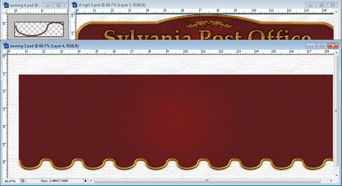
Yeah, not so great. I ended up just drawing my own edges and learnt how to draw wavy lines with the pen tool. I drew that thing on the upper left of the picture below and just copied and pasted it over and over until I had the edge I wanted. Then I filled in the gaps with colour.

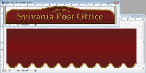
I've decided to use 'Sylvania Post Office' on the sign after asking around in the Sylvanian forums. 'The Post Office' was just too strange, despite being what was written on the original sign. I've also set the gradient to 'reflected' instead of 'radial' so there isn't that single spot of light in the middle of the sign. It had the effect of lightening the red too, which I'm happy with. Both the sign and the awning have been run through the texturiser but it's not really visible in these resized pics.

All I have to do now is print it and see if it looks any good on the building. I'm hoping it does. I don't really want to have to redo anything.

No comments:
Post a Comment